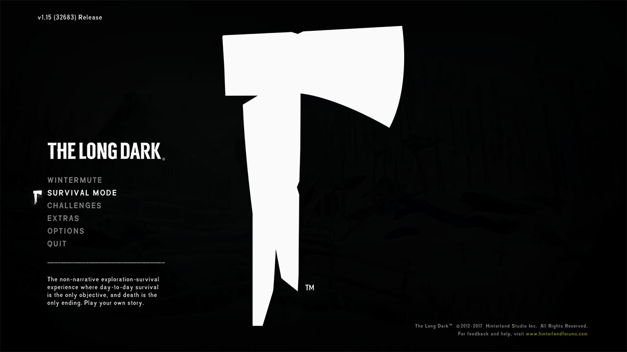
The Long Dark
Lead UI/UX Designer
Hinterland Studio
PC / Console
2017
The Long Dark is a first-person wilderness survival game set in the Canadian north following a geomagnetic disaster.
From the beginning, the team wanted players to focus on the environment rather than the interface. As Lead UI/UX Designer, my role was to develop systems that communicated critical survival information while keeping the screen as clean as possible.
The challenge was finding the right balance between atmosphere, usability, and player awareness in a genre that traditionally relies on large HUDs and constant status indicators.
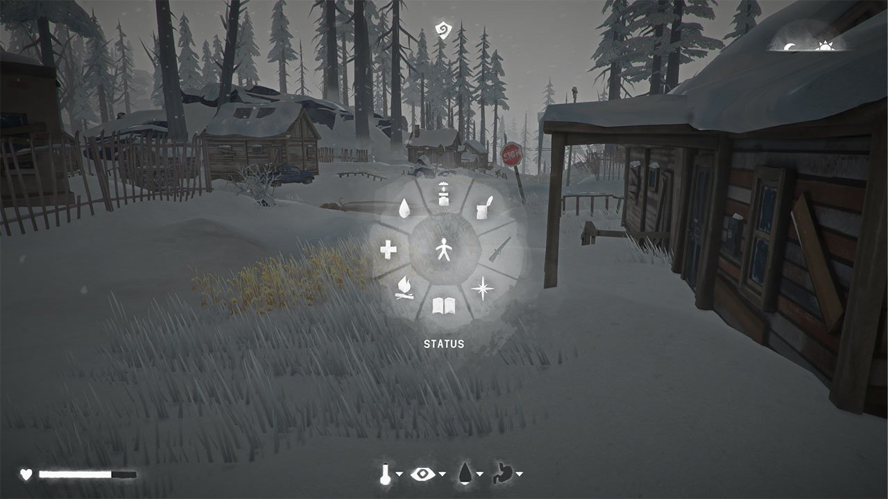
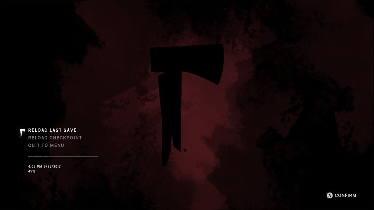
Communicating Information Without a Traditional HUD
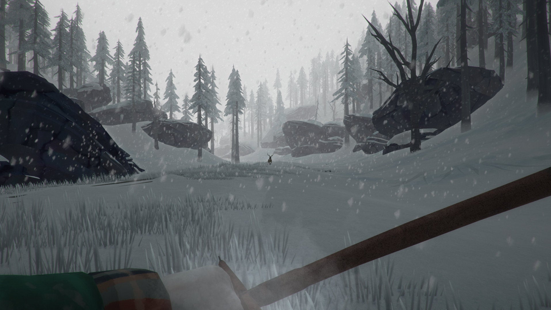
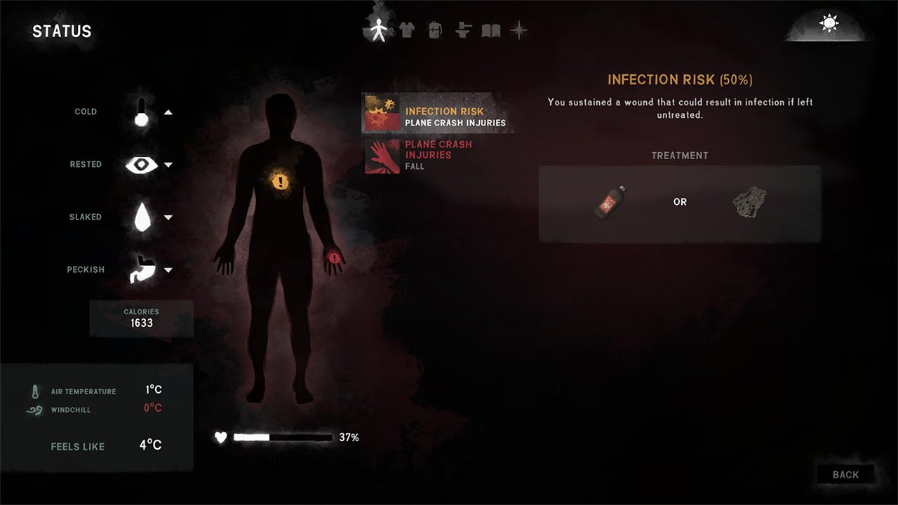
A core goal of the project was reducing the player's dependence on interface elements wherever possible.
Rather than displaying every survival stat on screen, we relied heavily on environmental, visual, and audio feedback. Changes in breath vapor, movement, animation, sound effects, and character dialogue all helped communicate the player's condition without requiring persistent meters and indicators.
This approach allowed the environment itself to become part of the feedback system while reserving interface elements for moments when detailed information was actually needed.
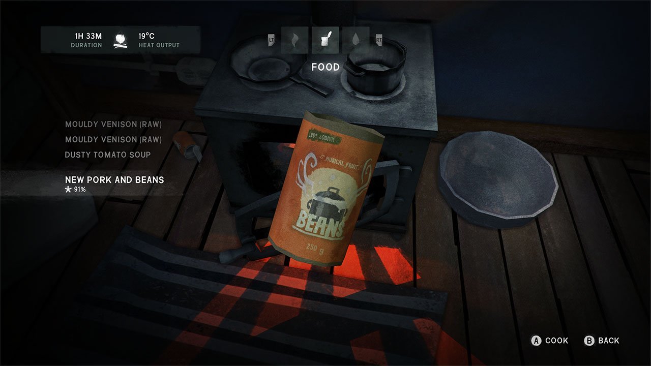
Evolving the Visual Language
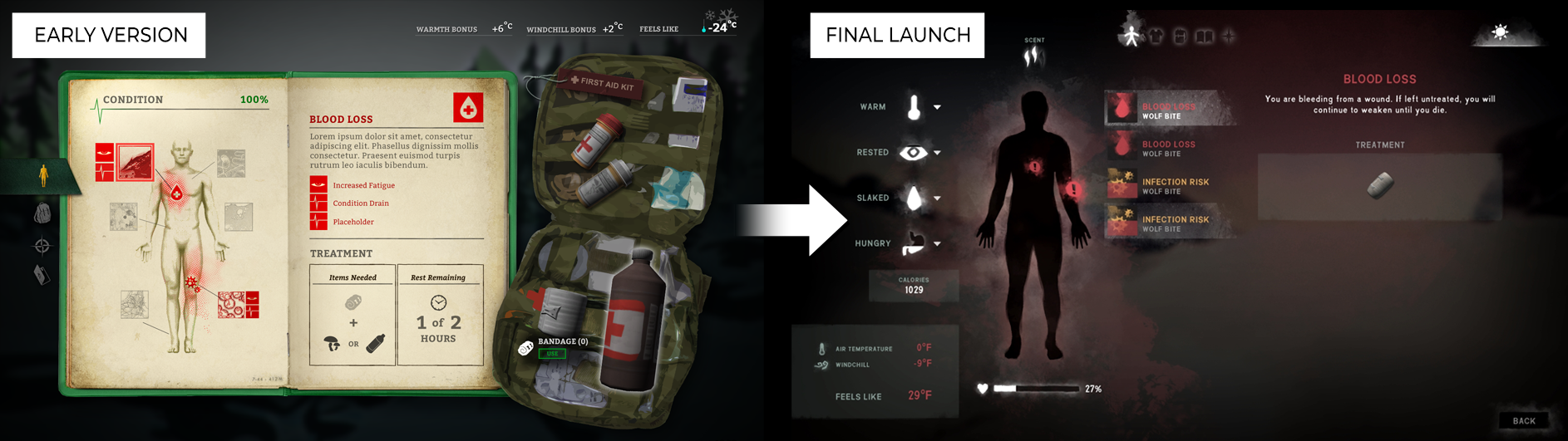
Early versions of the interface explored more skeuomorphic approaches, including notebook and journal-inspired presentations.
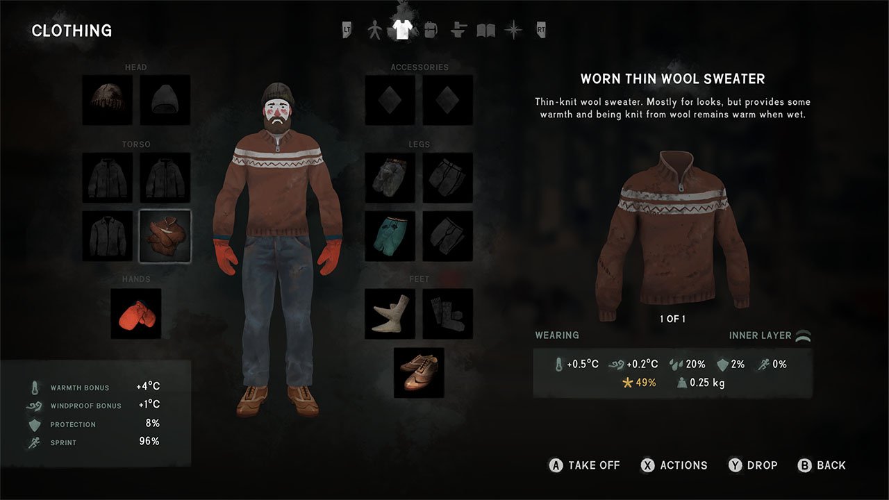
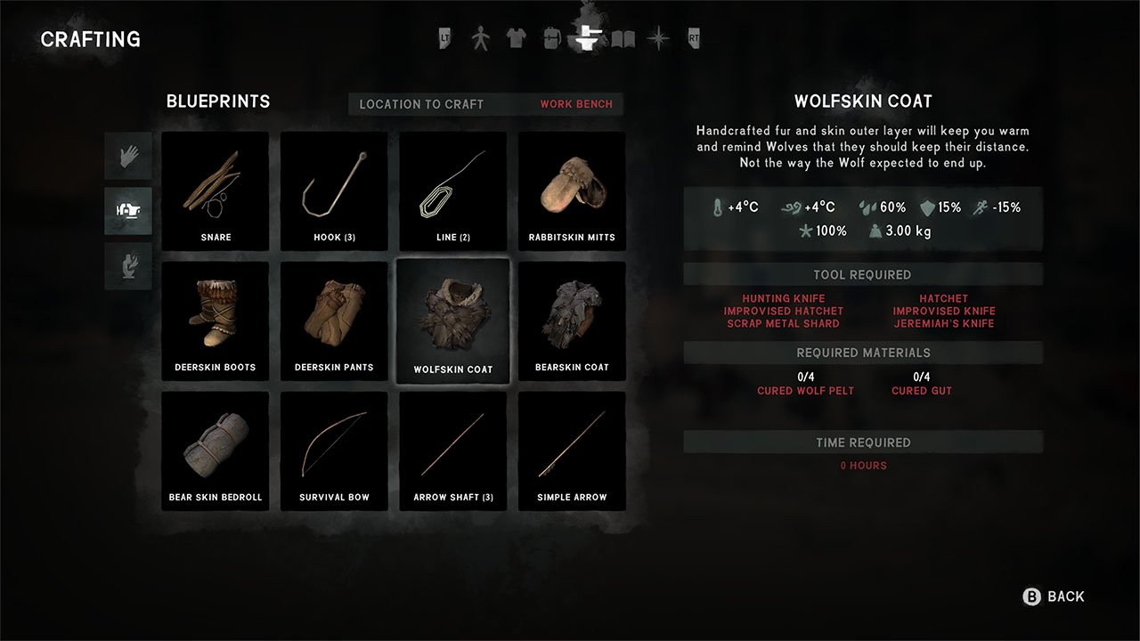
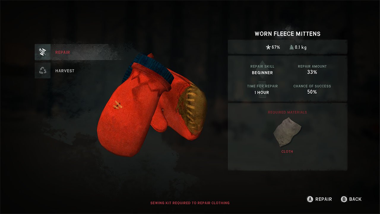
As development progressed, we moved toward a simpler visual language built around clean layouts, chalk-inspired iconography, and lightweight overlays. The goal was to reduce visual noise while maintaining clarity across survival, crafting, inventory, and condition-management systems.
The resulting interface felt more consistent with the game's painterly art direction and supported the slower pace of exploration and survival.

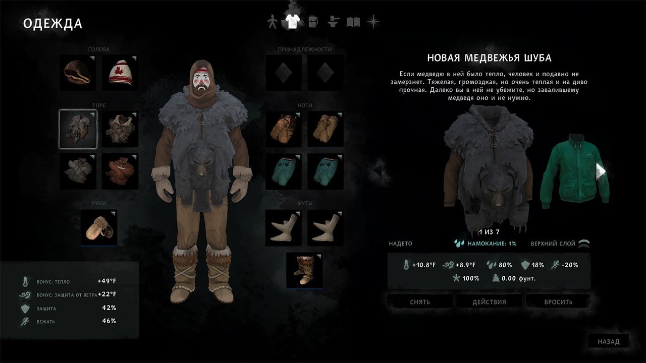
Typography & Information Hierarchy
Because survival gameplay depends on understanding a large amount of interconnected information, clear hierarchy was essential.
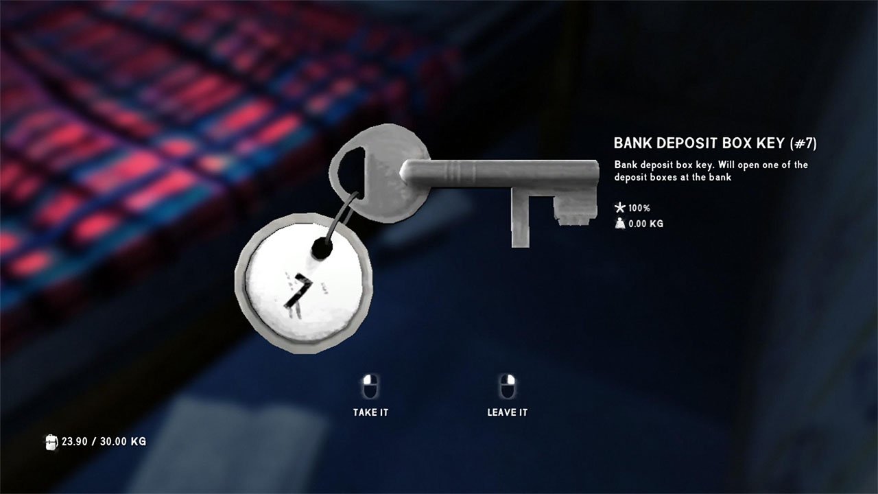
I developed typography, layout standards, icon systems, and menu structures that helped players quickly interpret condition, inventory, crafting, and environmental data without overwhelming the screen.
Special attention was given to readability, pacing, and reducing unnecessary interface complexity as systems expanded throughout development.


Process & Production
The Long Dark required close collaboration across design, engineering, narrative, and environment teams.
My responsibilities included interface design, wireframing, visual development, implementation, usability testing, and ongoing refinement throughout Early Access and production.
The work ranged from high-level UX decisions to detailed production tasks across inventory management, crafting, condition tracking, interaction systems, and navigation.
The Long Dark's interface became a key part of the game's identity by supporting the survival experience without dominating it.
By relying on environmental feedback, contextual information, and a restrained visual language, the UI helped reinforce the sense of isolation and self-reliance that defines the game.